Designing a poster has many aspects in common with writing a review – it’s essential to get across something of what the production is about, while at the same time producing an image that’s striking enough to grab the potential audience’s attention. As a photographer once said about his production photographs displayed outside the Royal Court Theatre – “My job is to get their bums off the Sloane Square buses and onto the Royal Court seats …”
*
 ‘The Ugly One’ is probably a good place to start. A play about a man, a very good and kind man, who is so spectacularly ugly that even his wife can’t bear to look at him. He’s an engineer, designing electrical connectors in his job, but his appearance is blocking his career advancement. A plastic surgeon makes him stunningly handsome, after which (of course) he becomes a complete bastard. But the surgeon carries out the same procedure on a host of other men, and finally the (ex) Ugly One is surrounded by lookalikes, and no longer special or highly regarded. I had to search a bit to find a suitable yellow cable connector.
As with all these poster images – just click on the image to see it bigger.
*
 ‘Breaking the Code’ couldn’t be more different. Alan Turing was a mathematician whose wartime work helped build the first computers. These were used to decode the messages encrypted by the German military using the ‘Enigma’ machine. ‘Enigma’ turned clear text into gibberish, and back again for the recipient. I was intrigued that the play’s title had the same number of letters as the author’s name, so I used that in the poster’s wording. Turing himself was homosexual, illegal in the forties, with a secret life (he committed suicide after being convicted of the offence). Earlier last century gays were defined as ‘inverts’, so I’ve shown Turing both positive and negative – (or clear and encrypted …)
*
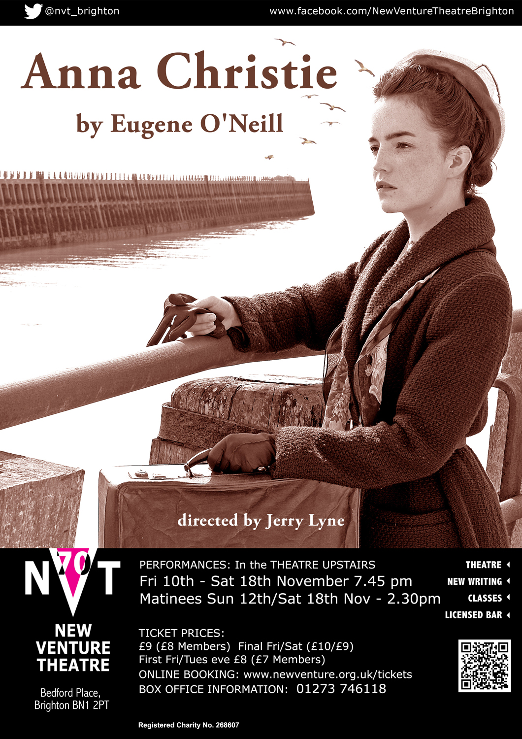
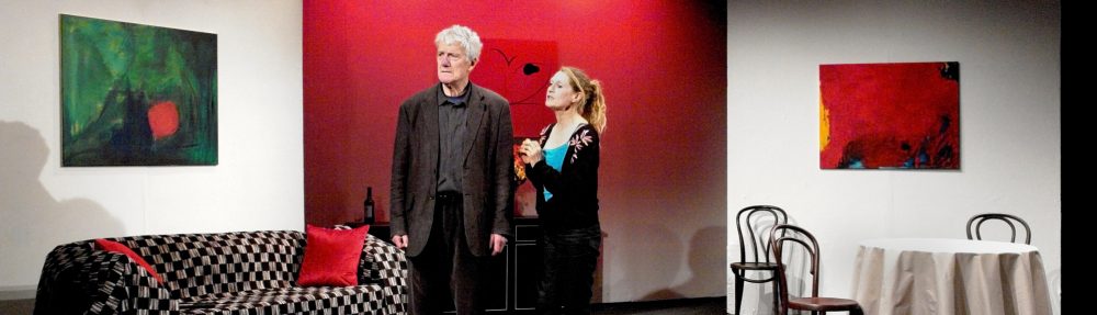
Anna Christie goes to Boston to meet her sailor father, who she hasn’t seen in fifteen years, and the play’s action takes place in a dockside bar and on a coal barge.
So we wanted to illustrate the character in an appropriate location, and make the photograph look decades old. I’ve sailed into Newhaven harbour many times so I knew the breakwater – and where to position the actress. All it needed then was for Tamsin to Photoshop in some gulls.
*

‘The Winterling’ also needed a character in an appropriate location – in this case the wilds of Dartmoor in wintertime. So, no problem there, then . . .
Some gangsters are hiding out in an abandoned farmhouse on the moor, and a young girl has arrived there the previous year, along with a dog. A winterling is something that you’ve had over one winter, so the director wanted them both on the poster. I found the blasted tree not too far from my home, and bleached a lot of the colour out of the photo to make it look chilly. Brrrrr!
*
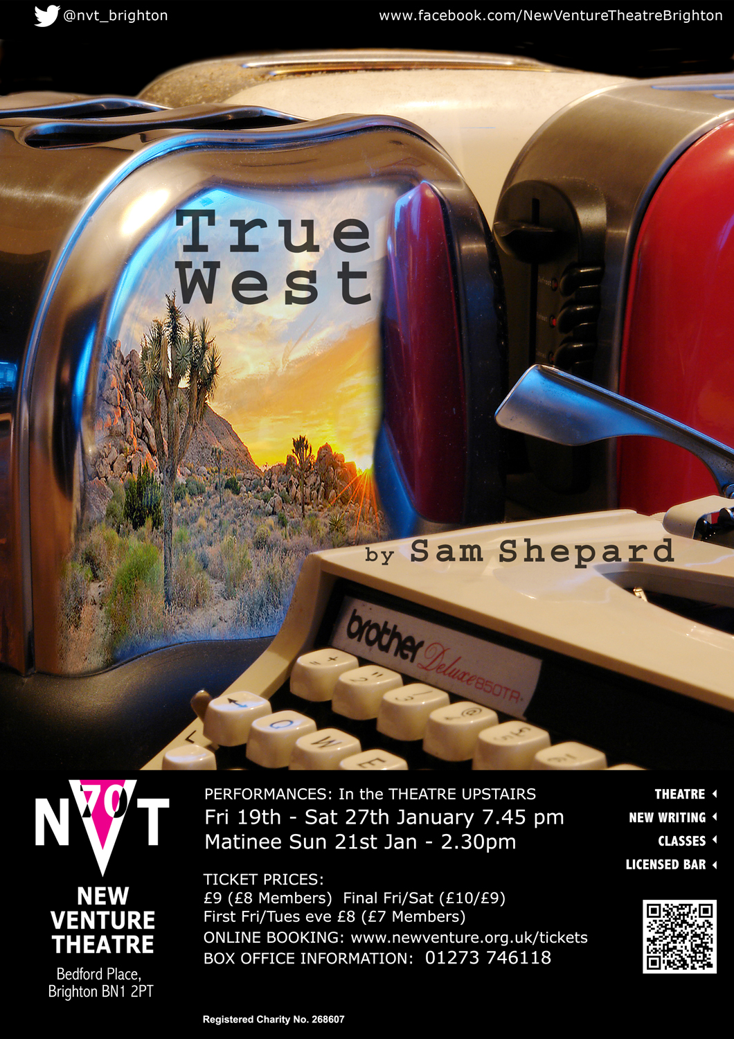
‘True West’ needed a totally different treatment. Sam Shepard’s play is set in the contemporary American West, near Los Angeles, with two brothers – one a scriptwriter working on a film, the other a no-good drifter. This brother carries out a series of petty thefts, stealing consumer goods, especially toasters, from the neighborhood houses – but he’s also obsessed with writing his own movie, a return to the classic theme of the Old West.
I’m a photographer, remember, so a lot of my posters use a photograph as the starting point (and I make no apology for that …).
*
 Here’s another one done as a still-life photograph. For ‘Streetcar’, I wanted to capture the macho violence of Stanley Kowalski’s life, and how it destroys Blanche’s memories of the antebellum Southern mansion where she grew up. Smashing the glass was tricky, but not as much as getting the fracture lines to show up. The whiskey (Irish) was real, and the glass got drunk several times before I was happy with the shot …
I was careful to include a Jack and a Queen in the poker cards.
*
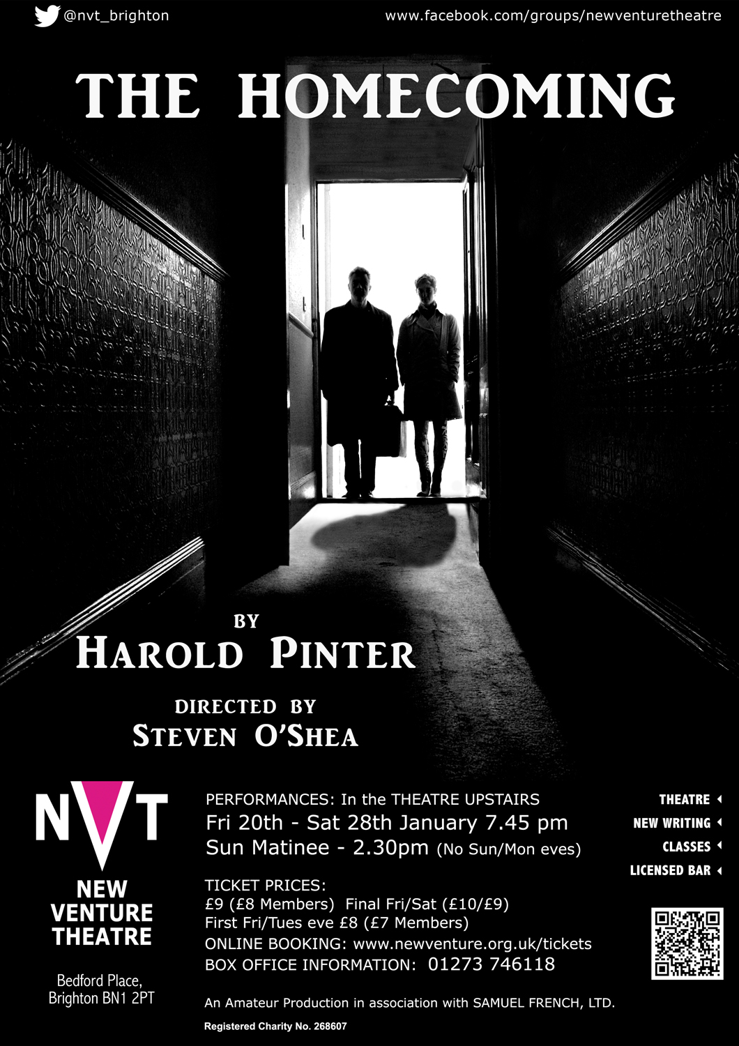
A photograph, too, for this poster for ‘The Homecoming’, Harold Pinter’s play about disfunctional family relationships. Teddy brings his wife back from America to meet his family – a family riven with several generations of sibling rivalry. I wanted to portray the idea that the couple are just about to enter a place that’s very dark and threatening indeed. It’s really wife Ruth’s homecoming, though, so only she casts a shadow …
The names of author and director would normally be centred in this kind of layout, but I put them at bottom left, with the viewer’s gaze led there by Ruth’s shadow – so that (hopefully) I produce a slight jarring sensation in the viewer, preparing them for the disturbing scenes in store.
*

Some posters work best with a very simple image. Joe Orton’s masterpiece concerns two young criminals who have recently robbed a bank. Hal’s mother has just died, and the boys hide the loot in her coffin. This, however, leaves no room for the body …
The police arrive, and at one point Hal’s mother’s glass eye drops out of the coffin and rolls across the floor – did I mention that Loot is a comedy? Irresistible choice of imagery for the poster, then. Orton was an anarchic joker, and he used to write hysterically abusive letters to the newspapers, condemning his own plays. They purported to be written by a Mary Whitehouse prototype called Edna Welthorpe (Mrs), and the poster quotes are hers.
I’m a huge fan of Orton, and many years ago I saw Leonard Rossiter play the psychotic Inspector Truscott – just a few weeks before he died, in his dressing room during a performance of ‘Loot’.
*
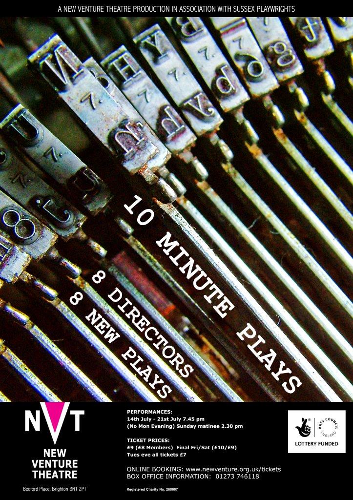 This one could really only be done using photography – nothing else would have got the close-up detail in the typewriter typebars. The poster for NVT’s ’10 Minute Plays’ competition had to portray the concept of ‘writing’, as it’s an evening of newly-written plays – though I wonder how many of the authors actually used a real typewriter? The design also allowed me to be bolder with the text alignment – using a version of ‘Courier’, of course.
Luck plays a part, as in so many projects – I wanted to feature on the ‘N’ typebar (as in New Venture) and only realised later that I’d managed to include the ‘8’ as well.
*
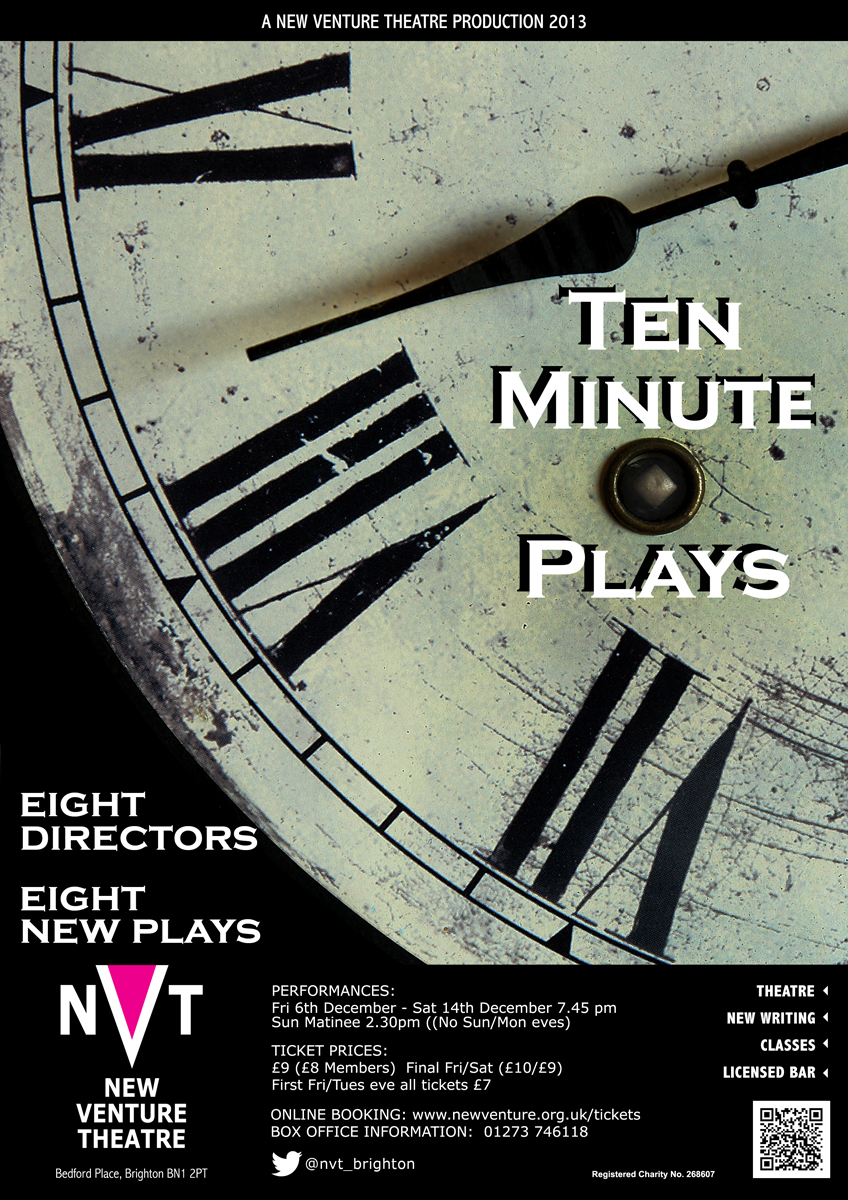 Another year, another competition, and so another poster. This time I went for the ‘ten minute’ aspect.
Still chasing that 8 – VIII in this version, of course – and so the whole thing became rather Gothic …
*
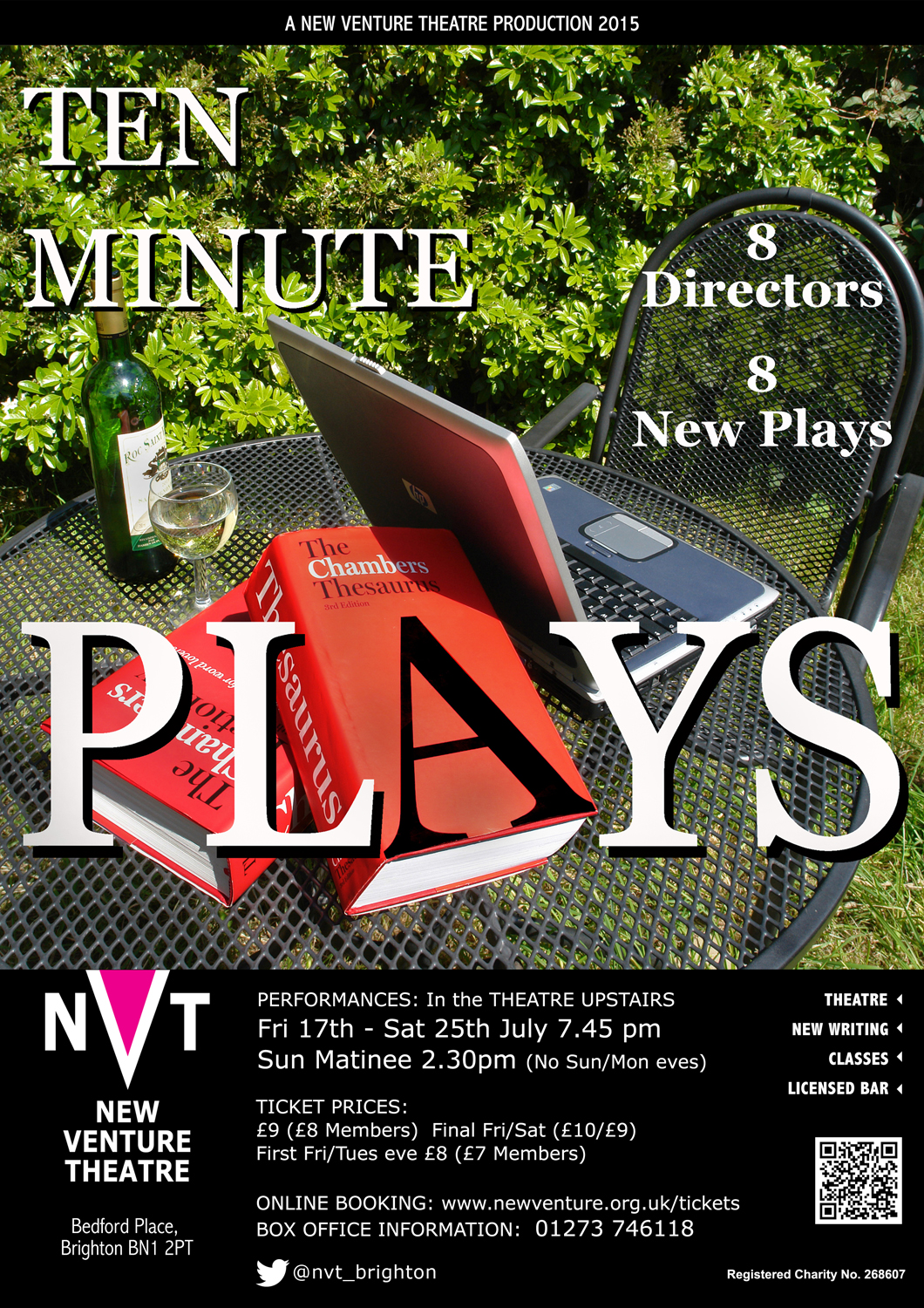
And again . . .
I went for the text option for this year’s competition. Words, Words, Words. And the wine helped too, naturally!
*
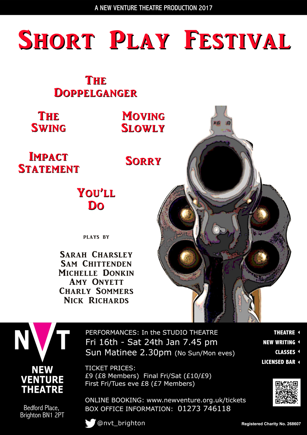
Another play festival at New Venture Theatre. Six plays this time, so I tried to use the imagery of a six-shooter revolver to suggest the impact of the six pieces. Arranging the play titles in a circle helped to carry the concept forward.
It was only when I’d finished that I realised that the six authors’ names created the same form as the revolver handgrip. Serendipity.
*
 ‘The Servant’ is a slightly clunky play that was also done as a great sixties’ black and white film. It’s about a rich man who returns from Africa to London and whose friends find him a house and a manservant to look after him. A psychological study of dependence, as the manservant feeds his addiction to alcohol – and working-class women – and gradually comes to be the dominant personality. The photograph is in B/W as I wanted to keep some of the sixties style and contrast, while pulling the viewers’ attention to the brandy – the one spot of colour in the whole image. Not showing the eyes seems to make the figure seem more sinister, and hopefully quite disturbing.
*
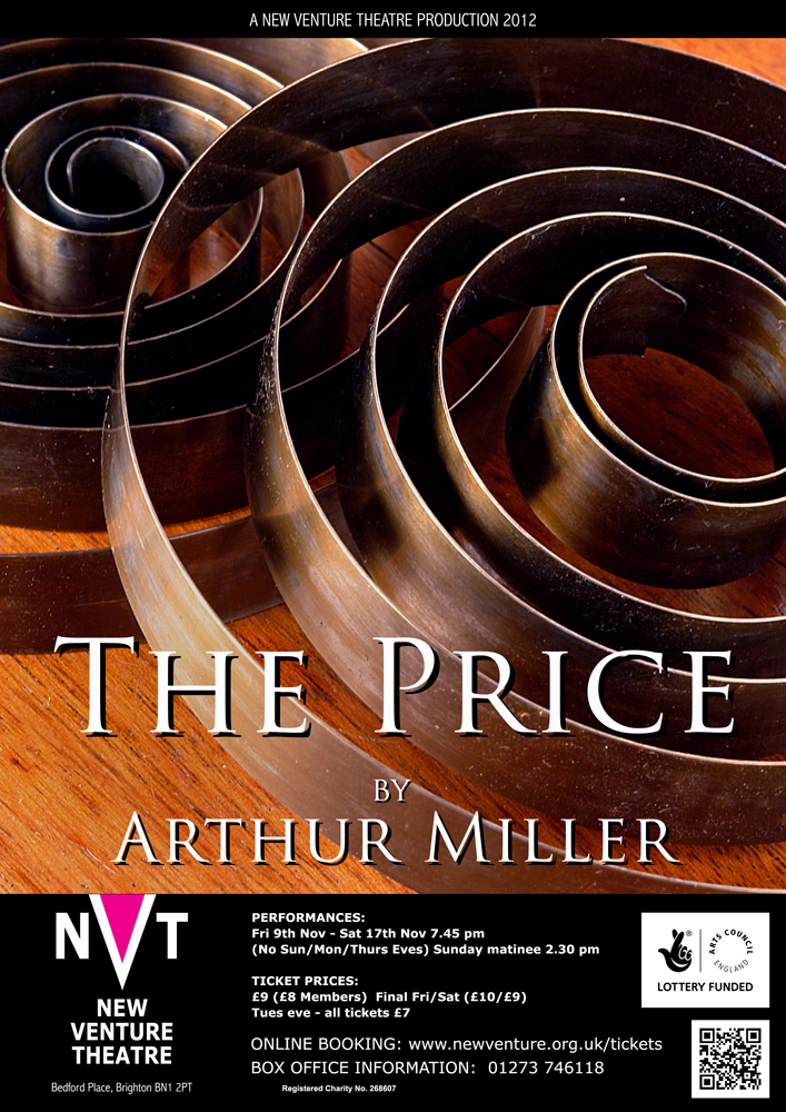 ‘The Price’ is a play about two brothers who argue about their dead father’s possessions, for which they want to get ‘a fair price’ when they sell them.
Being Miller, the play is really about unresolved family tensions between the two ageing men. The action takes place in New York, in the attic of the family home, surrounded by long-forgotten objects.
I saw the clock springs in a local horological shop, and they seemed to sum up the tensions between the two brothers, as well as the broken-down state of many of their late father’s things.
*
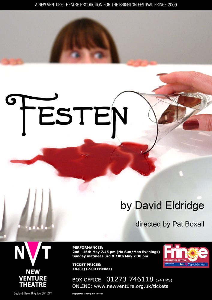 ‘Festen’ is another family drama, Danish this time, about the celebration (Festen is the word in Danish) of the 60th birthday of the head of a large and bourgeois family. At the dinner, the eldest son publicly accuses his father of sexually abusing both him and his twin sister (who has recently committed suicide) while they were children. The family initially rallies round the father to support him, but the presence of a young granddaughter forces them to face up to what has actually occurred.
I wanted to show the child, confronted with disturbing events that she cannot understand, and also give a sense of the shattering of comfortable social conventions.
*
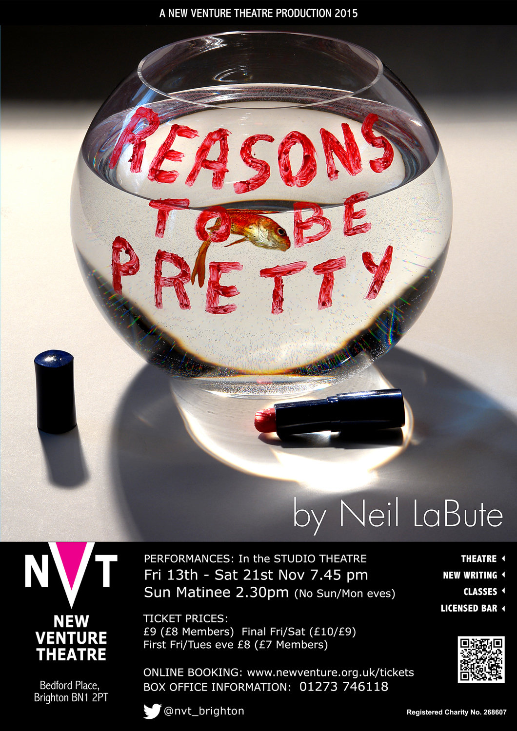 Posters need a strong image which conveys as much of the production’s themes as possible. Neil LaBute’s play ‘Reasons To Be Pretty’ is about people who have very few qualifications or prospects, and so fall back on their appearance. When a character’s ‘beauty’ is questioned, she gets incredibly angry, even threatening to kill her boyfriend’s fish! You can read an analysis of the play’s themes on my writing site.
I wanted to use lipstick – something normally used to enhance beauty – as the medium for expressing extreme anger. I couldn’t get the director to use it, though, and he went with his own design. I was gutted – but not as much as the fish . . .
*
 A lot of symbolism in this one, too.
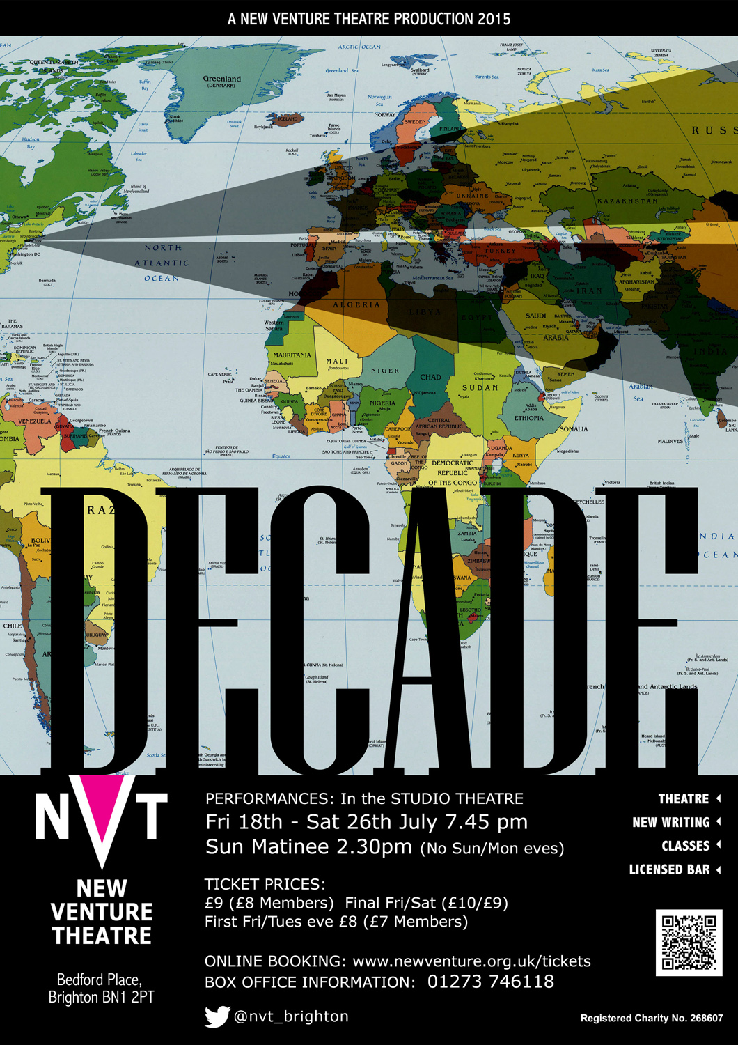
‘Decade’ is a set of a dozen or so short plays looking back at September 11, 2001. I wanted to give an idea of the Twin Towers, and how the ever-lengthening shadow of their destruction has fallen over Europe and the Middle East..
Like the previous one, the director finally went for a conventional New York panorama – but here’s the poster anyway, in its NVT format.
*
 ‘Connection unsecure: continue?’ is a two-handed play about life online, and how we deal with virtual relationships – often at the expense of real ones.
The two characters spend most of their time communicating via their computers, and I wanted to give the sense of them as digital entities rather than flesh-and-blood beings.
Once you go digital, of course, you can combine images in completely new ways …
*
 ‘Biloxi Blues’ tells the story of six young GIs at a basic training camp in Biloxi, Mississippi, in 1943.
They’re taught how to shoot and march, of course, but they also learn from each other about friendship, trust, race and class … and sex. Two important women characters feature in the boys’ development, and I wanted them to feature in the poster too. A rifle bullet has the same overall shape as a lipstick, and I wanted to explore the phallic subtext of both objects.
Plus – I love photographing metallic objects, they repay the effort needed.
*
 ‘Love Letters’ is a piece written by A R Gurney in 1988, and consists of letters and cards sent between two upper-class Americans over a period of fifty years. They are meant to be read out by two actors seated at a table, like a rehearsed reading. It’s popular with actors or celebrities, as they can fit it into a busy schedule without a rehearsal period. When I came to direct the piece, I chose to do it with Andy (in the present, after Melissa’s funeral) reading his past letters to Melissa, and her replies being read by the actress seated at rear, under dimmer light, so that it was unclear whether she was Andy’s memory, or a ghost.
.*
 I’m a great admirer of Brian Friel – you can read my analysis of ‘Faith Healer’ on my writing site.
‘Dancing at Lughnasa’ is an examination of the continuing attraction of the old pre-Christian religions, both in 1930s Ireland (Lughnasa is the Celtic festival of Lugh, the God of the Harvest) and in Africa (Father Jack has just returned from Uganda).
I do a lot of posters in conjunction with my wife, Tamsin, and this is one of those.
*
 But I produced this (unused) version also.
I still feel that it brings out the travails of Catholicism when faced with the power of paganism.
*
 And here’s one which uses photography to produce the poster image, but isn’t really a photograph. Edward Albee’s ‘Three Tall Women’ is actually the story of one tall woman, told to us by the woman herself, at three stages of her life.
 A different kind of celebration here – ’A Midsummer Night’s Dream’ has the Rude Mechanicals performing the play of Pyramus and Thisbe for the court of King Theseus. At one point the lovers glimpse each other through a chink in the Wall (another player, Wall, holds his hands to form a small aperture).
I wanted to get the effect of someone peering through a small chink, formed by meaty, dirt-stained tradesman’s hands, referencing that scene from the play, but also engaging directly with the viewer of the poster.
*
 What to say about ‘Dinner’? Only that it’s the dinner party from hell, with spouses, lovers (current and ex), lobsters (cooked and VERY live), violence – and a suicide …
I sourced the lobsters at Riddle & Finn in The Lanes in Brighton, and photographed them there. A great fish restaurant.
*
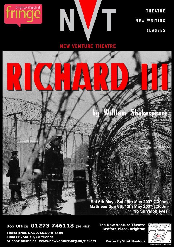 Plenty of violence in Richard III, too. The director wanted to set the play in the current era, and bring in references to imprisonment without trial at Guantanamo Bay.
I had a photograph I took years ago at Greenham Common, with razor-wire and police guarding the American cruise missile base. It seemed appropriate to the theme of an overly oppressive police state …
*
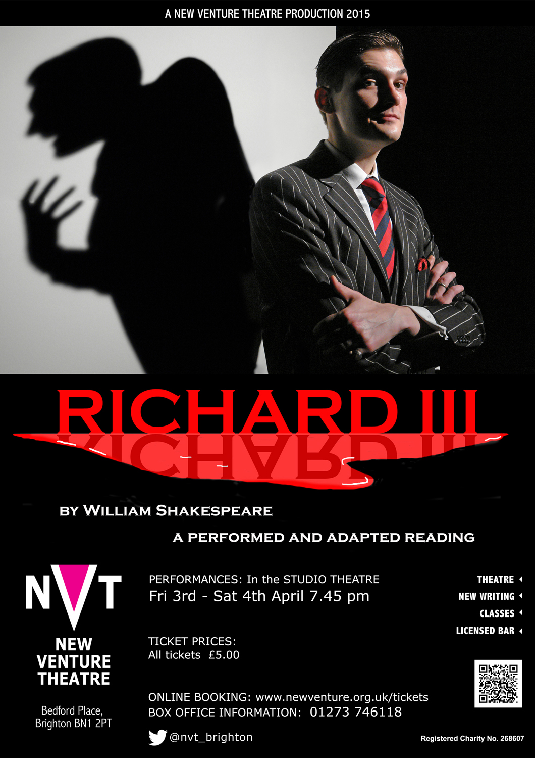
That production was in 2007, but in 2015 we did Richard lll again, as a rehearsed reading this time. Something very strange happened with the shadows on this one!
*
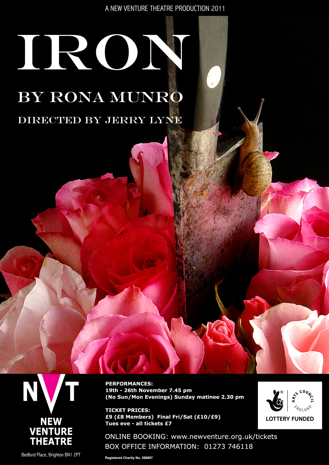
A lot of violence in the back-story of Iron, as well. It’s about a woman who seemingly has murdered her husband, and spent years in jail as a result. But there are deeper layers to the story, and she’s probably protecting her daughter. You can read my critique of the play on the Analyses page of my stratmastoris.wordpress.com website. I wanted to produce a graphic portrayal of a domestic killing.
The snail really did slither up the blade – it’s not been Photoshopped in . . .
*
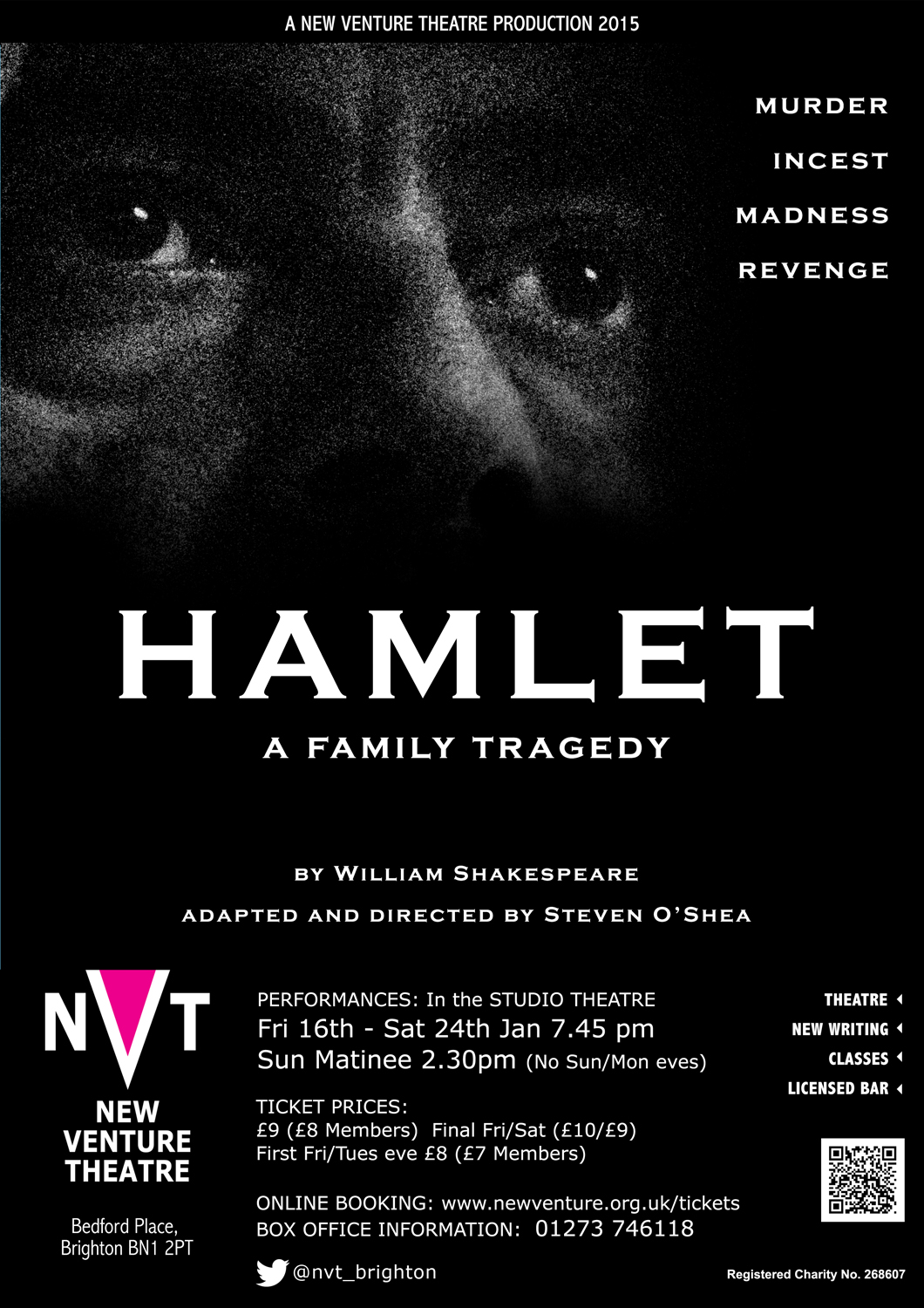 Another poster in black and white; another Shakespeare – ‘Hamlet’ this time. I’m constantly trying to push the boundaries of layout, and I wanted the image to pull the viewers into the poster and direct them towards the text at the upper right.
This was a cut-down version of ‘Hamlet’, with just the two families, and everybody seems to be watching or spying on each other. The eyes could be the Ghost of Hamlet’s father, or they could be Polonius, watching from behind the arras, or Claudius racked by his guilt – or they could be Hamlet himself.
*
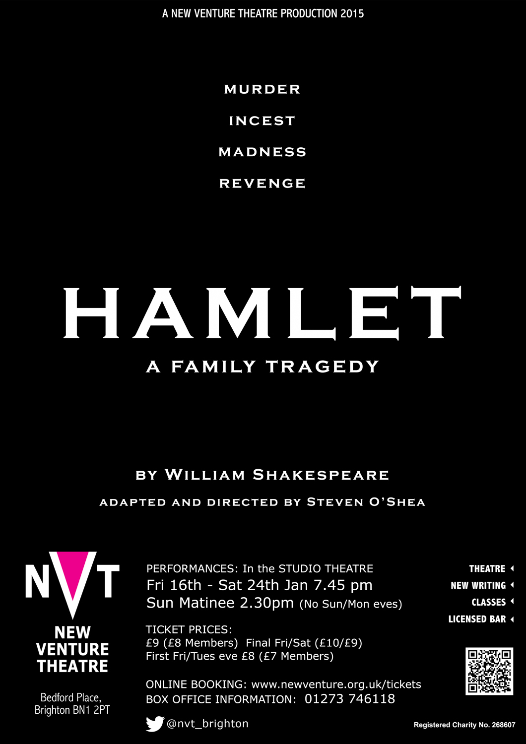 I couldn’t convince the production’s director about the eyes, though, so finally I had to use just the text. But I rearranged the layout like this, and the typeface makes the whole thing look sufficiently formal, as well as rather Gothic.
That’s what’s needed for a play like ‘Hamlet’
*
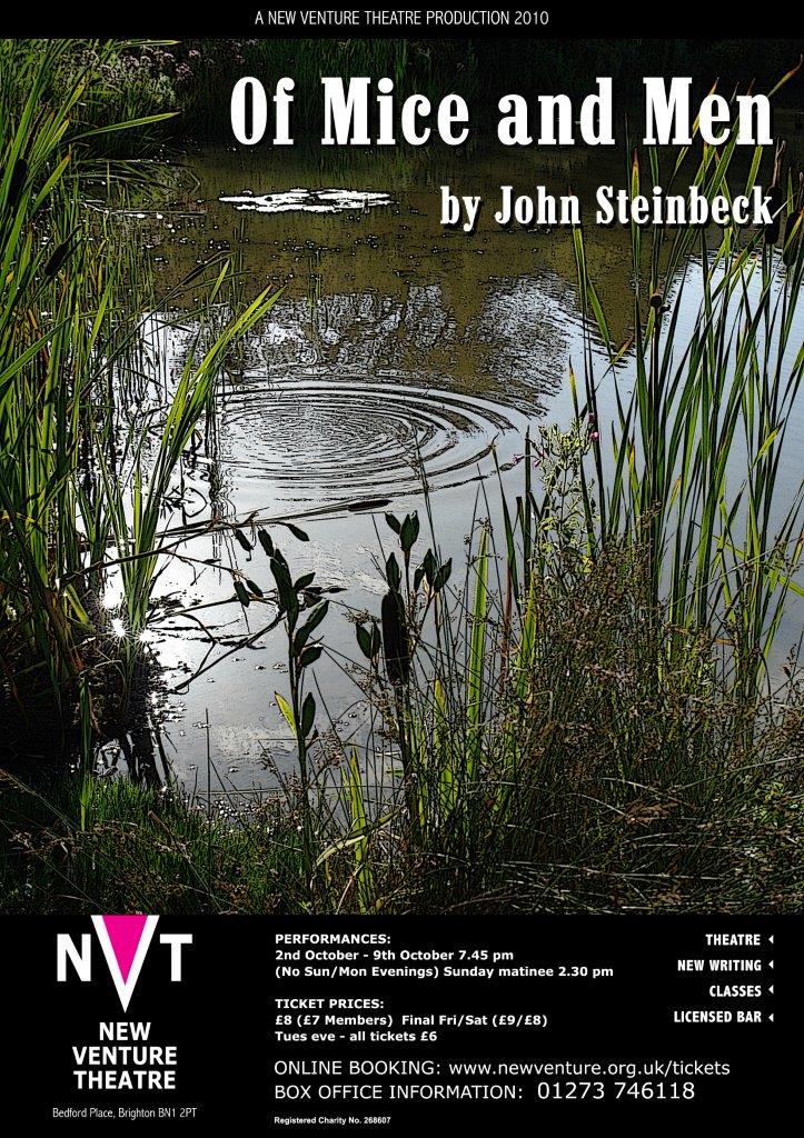 Here’s ‘Of Mice and Men’. I hadn’t realised until we did the production that Steinbeck himself had re-written the book as a play. I won ’Best Lighting Design’ at the Brighton and Hove Arts Council Drama Awards in 2010 for the lighting on this one.
The director wanted to show the river that George and Lennie reach in their travels, and that Lennie eventually dies next to. I put ripples in (or rather, Tamsin chucked pebbles into the water) to give a sense of the consequences of events spreading out from their point of origin. You’ll recognise the Marlboro typeface for the title, of course …
*

And here’s ‘A Rational Death’ – a rehearsed reading of a new play by Gareth Buckell. My first stab at directing, which gave me the experience to take on a full length play – ‘A Number’. Both plays’ posters get a lot of their impact from a bold use of colour.
*
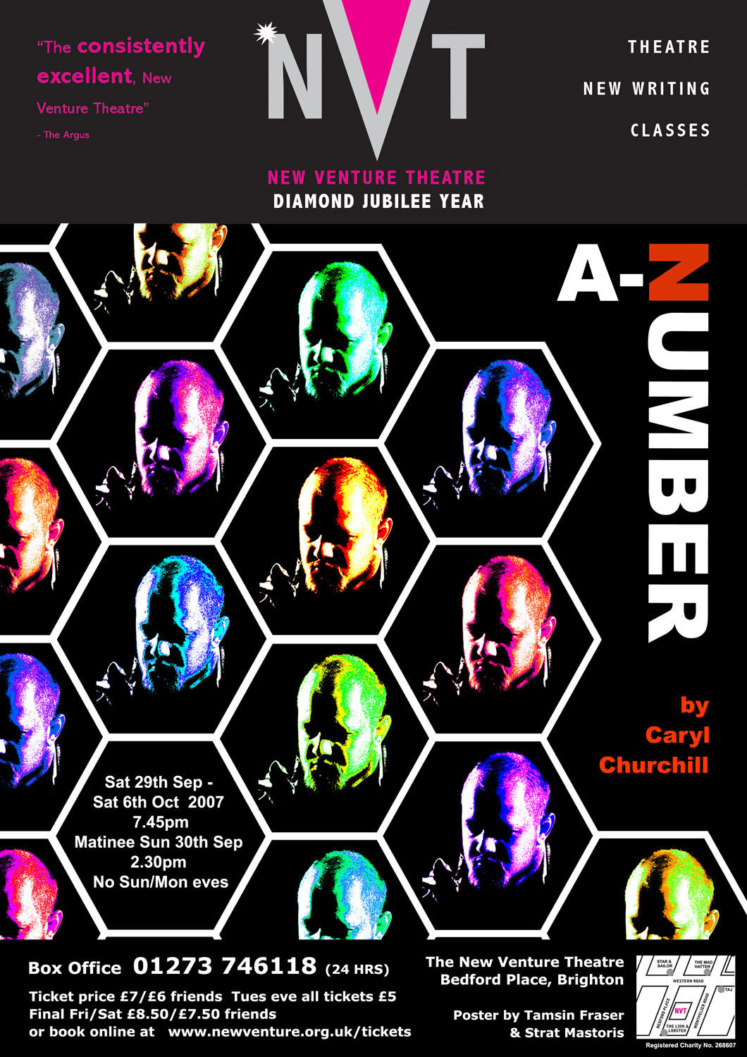 A lot of different elements come together to make up a poster – the images, the layout, the text itself and its own arrangement within the poster layout. Ideally everything should help to reinforce the poster’s message.
Caryl Churchill’s ‘A Number’ is about a father who has his young son cloned, and unknown to him the doctors produce a number of (obviously) identical boys. Identical genetically, of course, but how much will upbringing and environment alter them?
Just two characters, with the younger one playing three of the cloned sons. I took a photograph of the young man, then used a range of colour treatments to suggest different temperaments in the set of cloned individuals. Putting the pictures into a hexagonal grid suggested the honeycomb structure of a bees’ nest, where individuals become workers or queens depending on how they are fed. I tried to do the same with the title, too, using a typeface whose N is identical to Z, so that we read the letter based on its context. Nature versus nurture …
*

I like what you guys are up too. This kind of clever work and exposure! edceedeedbcg
Dropped by your website. Your posters are great – thoughtful, creative and well designed! Hope all is well.